Game UI design
A game interface has to be readable at a glance and stay out of the way. These posts show how we design Mytheria's menus, HUD, inventory and maps, with the real screens.
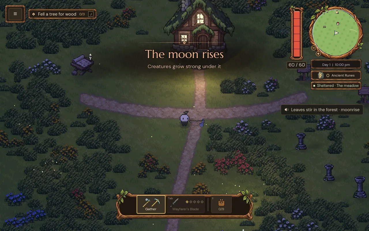 23 October 2026Accessibility settings in games: every option we built and whyWhich accessibility settings should a game have? Every option in Mytheria, from sound captions to hold to confirm, what each does, and a demo to try.
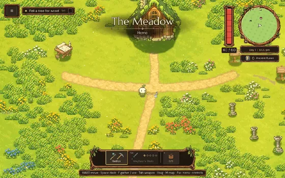 10 October 2026Pause menu design: six ways to build one, comparedSix ways to build a game pause menu, from a plain panel to a painted scene, what each costs, and why Mytheria uses one painted wooden plate over the world.
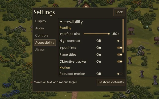 8 October 2026Game UI readability: text sizes that work on every screenHow big should game UI text be? Valve's Steam Deck minimum, Mytheria's measured font sizes on every screen, and an interface size setting that reflows.
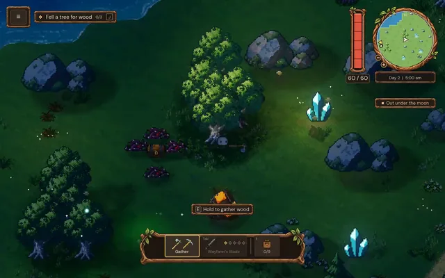 6 October 2026Game HUD design: a compass and a clock in oneHow the HUD in Mytheria puts map, time and day in one corner: a clock that fills around the compass, and a readout that shifts colour with the hour.
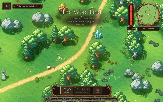 4 October 2026Minimap design: show only what helps the playerHow we designed Mytheria's minimap: a calm round window, icons that keep their size, arrows on the rim, and six zoom steps. Real footage from the game.
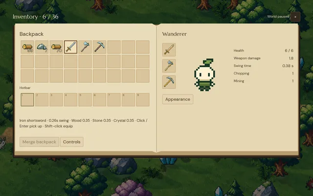 3 October 2026Game inventory UI design: five versions and what each one taught usMytheria's inventory went through five designs, from a flat paper book to a live character on a stage. Step through each one and see what we changed.