Game UI readability: text sizes that work on every screen
How big should game UI text be? Valve's Steam Deck minimum, Mytheria's measured font sizes on every screen, and an interface size setting that reflows.
On this page
The same game might be played on a 7-inch handheld, a desk monitor or a TV across the room, and text that's comfortable on one can be tiny on another. In Mytheria, our pixel-art co-op game, we pick text sizes against one fixed canvas, measure them instead of guessing, and give players a setting that makes everything bigger without breaking the layout.
Every size below was measured in the game for this post: a small development tool lists every piece of text on screen with its size.
How big should text be in a game?
Valve's rule for the Steam Deck is a good floor for any game: no on-screen character smaller than 9 pixels at 1280x800, readable from 30 cm, and 12 pixels whenever possible. Valve also recommends letting players change the text size and, when possible, the contrast. On bigger screens the right size depends on how far away the player sits, so the safest plan is to design for the handheld and let the text scale up from there.
The short answer
How we keep Mytheria's text readable:
- The interface is designed on one 1280x800 canvas, the Steam Deck's own resolution, and scaled to fit any window.
- Text is 12 pixels or more on that canvas, except the key letters on the hotbar, at 10.
- An Interface size setting from 100 % to 150 % grows the text and leaves the art alone.
- At bigger sizes the layouts rearrange themselves instead of shrinking or cutting text.
- Text over the world sits on a dark plate or has an outline, both heavier in high contrast mode.
- A tool measures every screen at every setting.
Design on one canvas
Mytheria draws its interface on a 1280 by 800 canvas, then scales the whole canvas to fit the window, keeping its shape. The scale is the smaller of the two ratios: width over 1280 and height over 800. On a Steam Deck that's exactly 1. In a 1920x1080 window it's 1.35, and our measurements show every piece of text exactly 1.35 times bigger: the 12-pixel clock becomes 16.2 pixels. On a 4K screen it's 2.7.
A size chosen once then holds everywhere: if the text works on the handheld, it takes up the same proportion of the screen on every other display.
What sizes do we use?
These are the measured sizes on five screens at the default interface size, in pixels on the 1280x800 canvas:
| Screen | Smallest text | Typical text |
|---|---|---|
| Playing (HUD) | 10 (hotbar key letters) | 12 |
| Bag | 14 | 15 |
| Map | 13 | 16 |
| Journal | 13 | 14 |
| Pause menu | 12 | 19 |
The playing screen has the smallest text because the world needs the space: the clock, the hotbar labels and the objective line sit at 12, and the little key letters on the hotbar at 10. Menus pause the game and can afford bigger type, so their typical text is 14 to 19.
Check the letter height
A font size is the height of the font's whole box, which is bigger than the letters in it. In DM Sans, the font we use for interface text, capitals are 70 % of the font size and lowercase letters about half. A 12-pixel label has capitals 8.4 pixels tall and lowercase letters about 6. When you check a size against a rule like Valve's, check which of the two the rule means, and look at your font's own proportions: some fonts have much larger lowercase letters than others at the same size.
How big does it look from where you sit?
Pixels alone don't tell you if text is readable, because a TV is far away and a handheld is close. What matters is how big the letters look from where you sit. Pick a screen and an interface size, then set your distance. The bars compare our text with Valve's minimum, 9 pixels on a Steam Deck held 30 cm away:
Pick a screen and a size, then set how far away you sit
On a desk monitor everything looks comfortably big. On a TV across the room the smallest text ends up about the same apparent size as Valve's minimum, which is where the interface size setting comes in.
Let players make text bigger
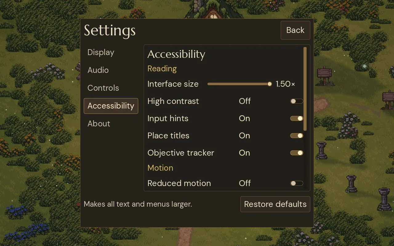
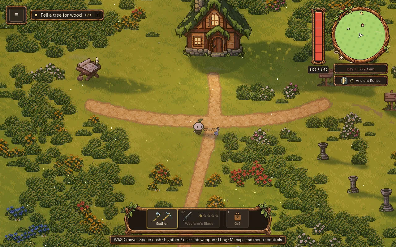
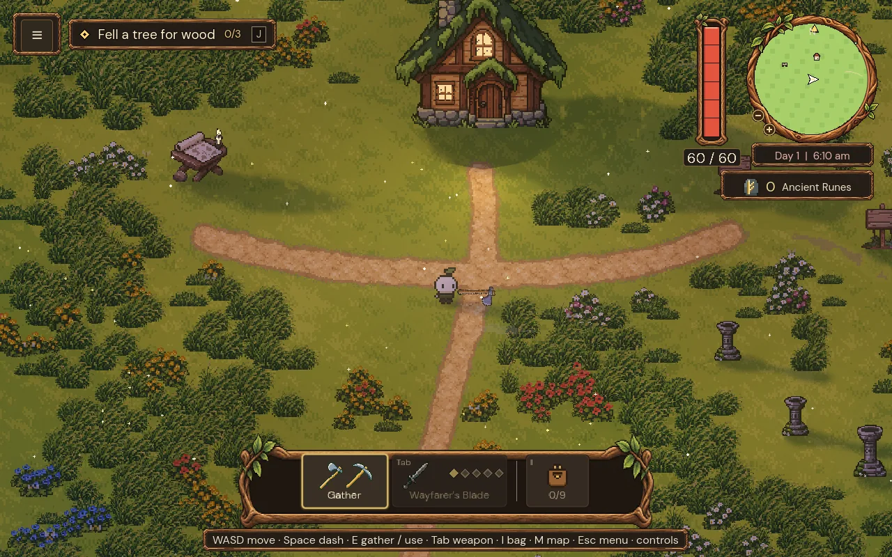
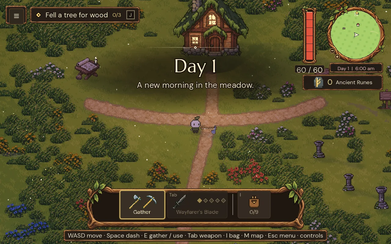
Mytheria's Accessibility settings have an Interface size slider, from 100 % to 150 % in steps of 10 %. It applies the moment you move it, as in the clip at the top of this post, and it grows the text while the art keeps its size. (The pause menu's frame is the exception: it grows too, as far as the window allows; why it's built that way is in pause menu design.) The HUD's frames, the bag's book and the map stay the same size, so the world doesn't get covered. Step through the playing screen:
Step through the sizes, or use the arrow keys
The default. The clock and hotbar labels are 12 pixels on the canvas, the objective line 15.
Let the layout reflow
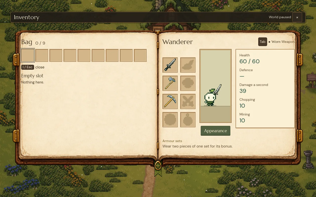
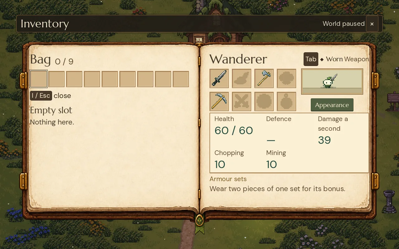
Making the text bigger inside a fixed layout quickly runs out of room: words get cut or overlap. So screens rearrange themselves at bigger sizes. In the bag, above 120 %, the character's stats move from one column to three, and the equipment slots from two columns to four:
Compare the bag at both sizes, or use the arrow keys
Equipment in two columns beside a tall portrait, stats in a single column.
The opposite also happens: a few labels in tight spots get a size ceiling. The count on an item slot stops at 22 pixels so it never covers its icon, and the clock under the minimap stops at 16 so it fits its plate. More on how the bag was designed in game inventory UI design.
Keep text readable over the world
Light text on a bright meadow disappears whatever its size. Every HUD readout sits on a dark plate, and text drawn straight over the world, like the objective line or the name of a place you enter, has a dark outline. The High contrast setting makes those plates darker and the outlines thicker and darker: the place title's outline goes from 6 to 9 pixels and from 80 % to 95 % opacity. The HUD itself is covered in our compass and clock HUD.
Measure instead of guessing
Text sizes drift over time: a new panel gets a slightly smaller label or a number gets squeezed, and nobody notices on a big monitor. Our development tool walks every visible text on the screen and reports its size on the canvas and in real window pixels. We run it over the playing screen, the bag, the pause menu, the map and the journal, at each interface size, and look for anything that shrank. That's how every number in this post was measured.
A checklist for game UI text size
- Design on one canvas, ideally the smallest screen you support, and scale it uniformly.
- Keep text at 12 pixels or more on a 1280x800 canvas, and never under 9.
- Check the letter height as well as the font size.
- Think about distance: TVs need bigger text.
- Offer an interface size setting that grows the text and leaves the art alone.
- Let layouts reflow at bigger sizes.
- Put text over the world on plates or outlines.
- Measure every screen at every size.
Further reading
- Game HUD design: a compass and a clock in oneHow the HUD in Mytheria puts map, time and day in one corner: a clock that fills around the compass, and a readout that shifts colour with the hour.
- Game inventory UI design: five versions and what each one taught usMytheria's inventory went through five designs, from a flat paper book to a live character on a stage. Step through each one and see what we changed.
- MytheriaRead it on a Steam Deck, a monitor or a TV: a pixel-art co-op adventure for one to four players.
Wishlist Mytheria
Mytheria is a pixel-art co-op adventure for one to four players, coming to Steam for Windows, macOS and Steam Deck. A wishlist is the best way to follow it and to help us.