Pause menu design: six ways to build one, compared
Six ways to build a game pause menu, from a plain panel to a painted scene, what each costs, and why Mytheria uses one painted wooden plate over the world.
On this page
A pause menu is small, but players see it constantly, and its look sets the tone for every other screen. Before choosing a look for Mytheria's menus, our pixel-art co-op game, we built the same pause menu six different ways, each with a different construction method, and compared them side by side.
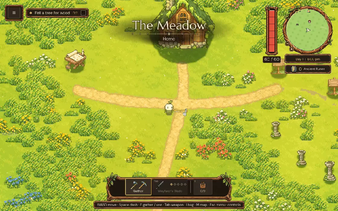
The clip at the top is today's pause menu in the game, filmed for this post.
What makes a good pause menu?
A good pause menu is calm and quick to use. One action, usually Resume, stands out, and the others are easy to read and reach with a keyboard or controller. It keeps the game's world in view behind it, and its look matches the rest of the game. It also has to cope with bigger text, smaller windows and new buttons without being redrawn.
The short answer
What we learned comparing six ways to build one:
- Every study had the same four buttons over the same game frame, so only the method changed.
- A panel built only in code is the most flexible and has the least atmosphere.
- A nine-slice frame fits any size, with fixed corners and stretching edges.
- Separate painted ornaments can move around for each layout, but must stay out of text and click areas.
- One painted plate looks the richest, but its shape is fixed.
- A full painted scene has the most mood, and hides your world.
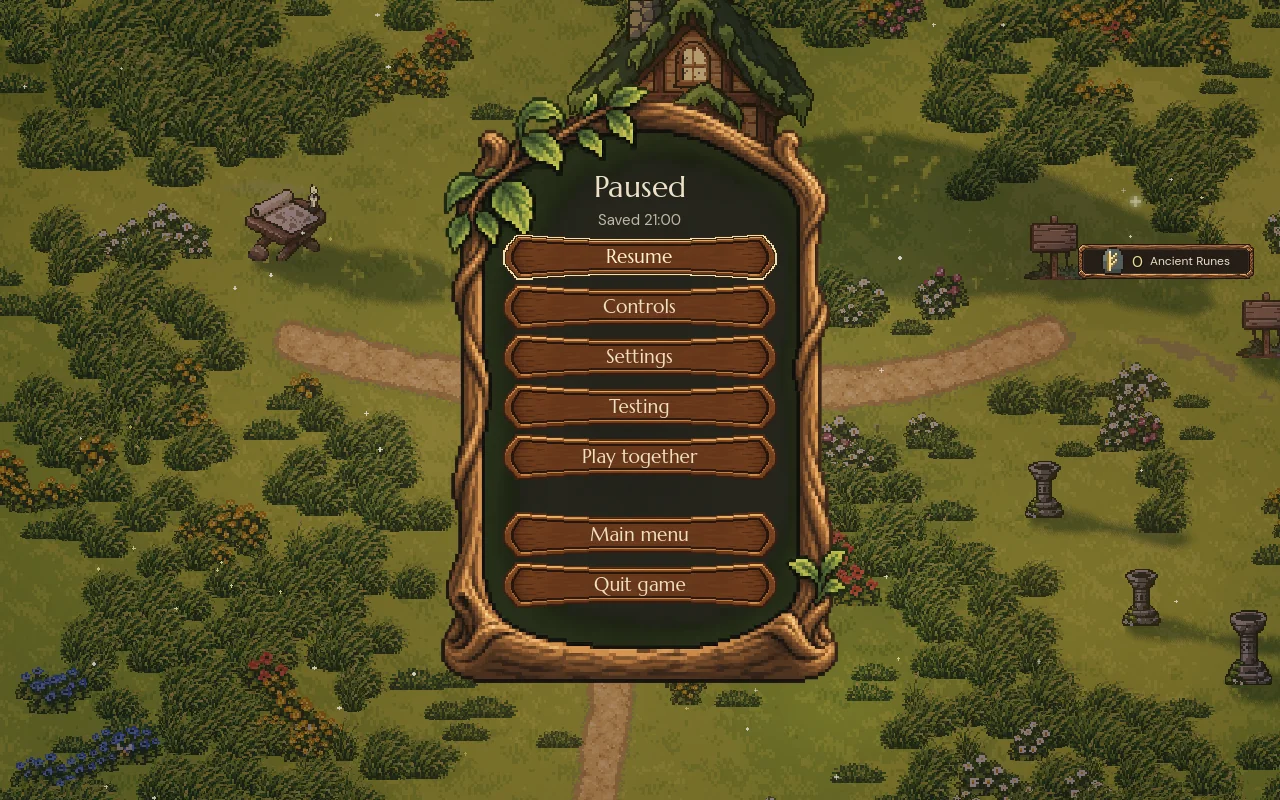
- Mytheria uses one painted pixel-wood plate over the paused world, with live wooden buttons.
Six ways to build a menu
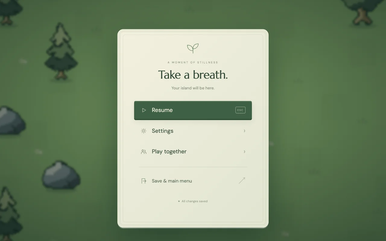
Each study below has the same heading and four actions, laid over the same frame from the game. Only the construction differs. These were browser mock-ups made for comparing; step through them:
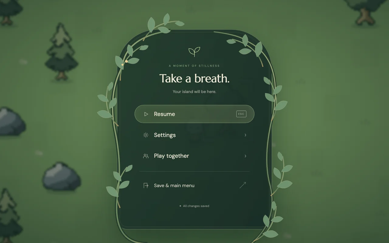
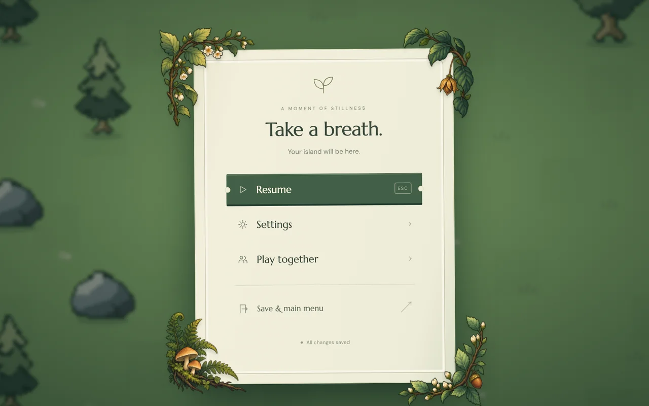
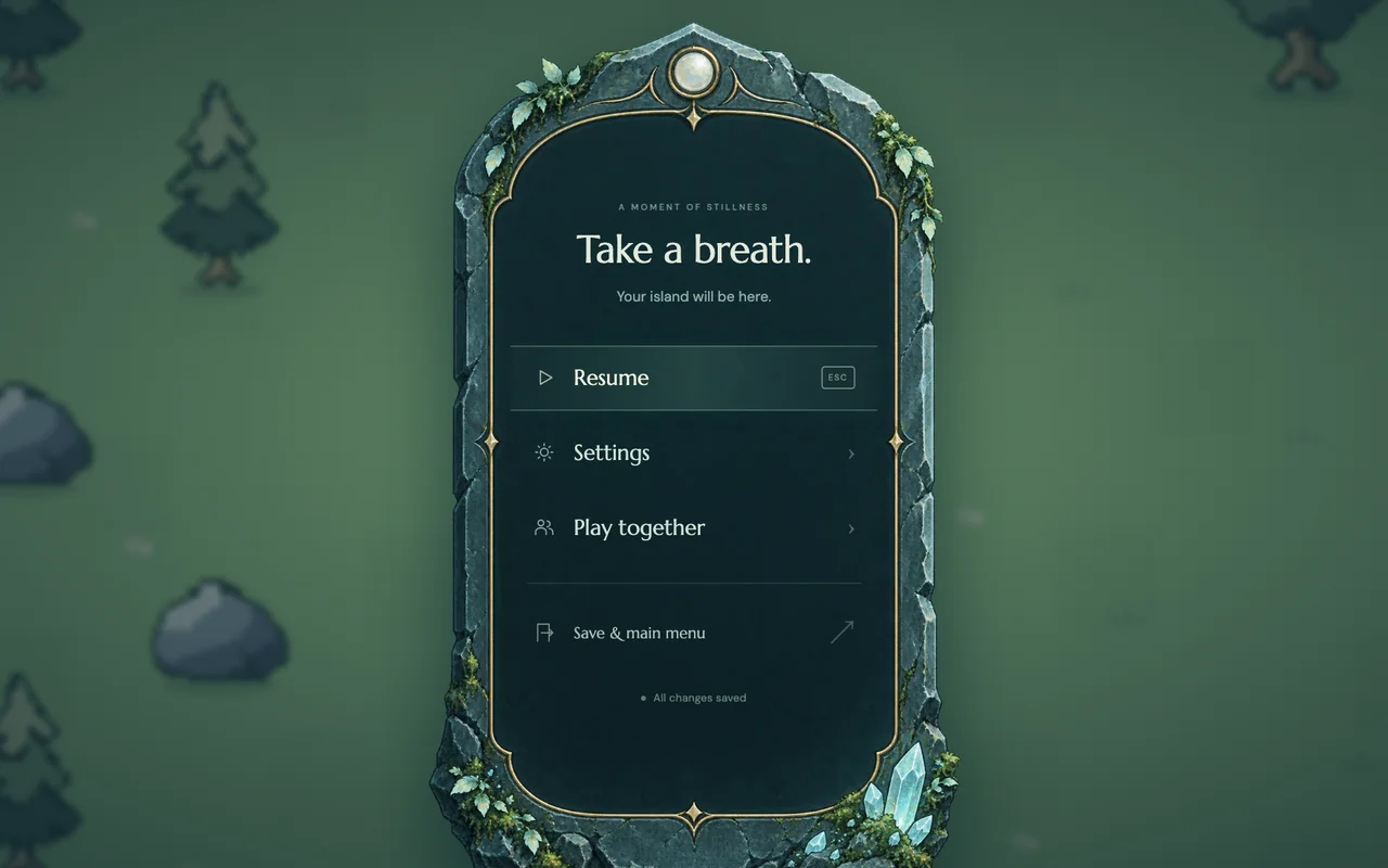
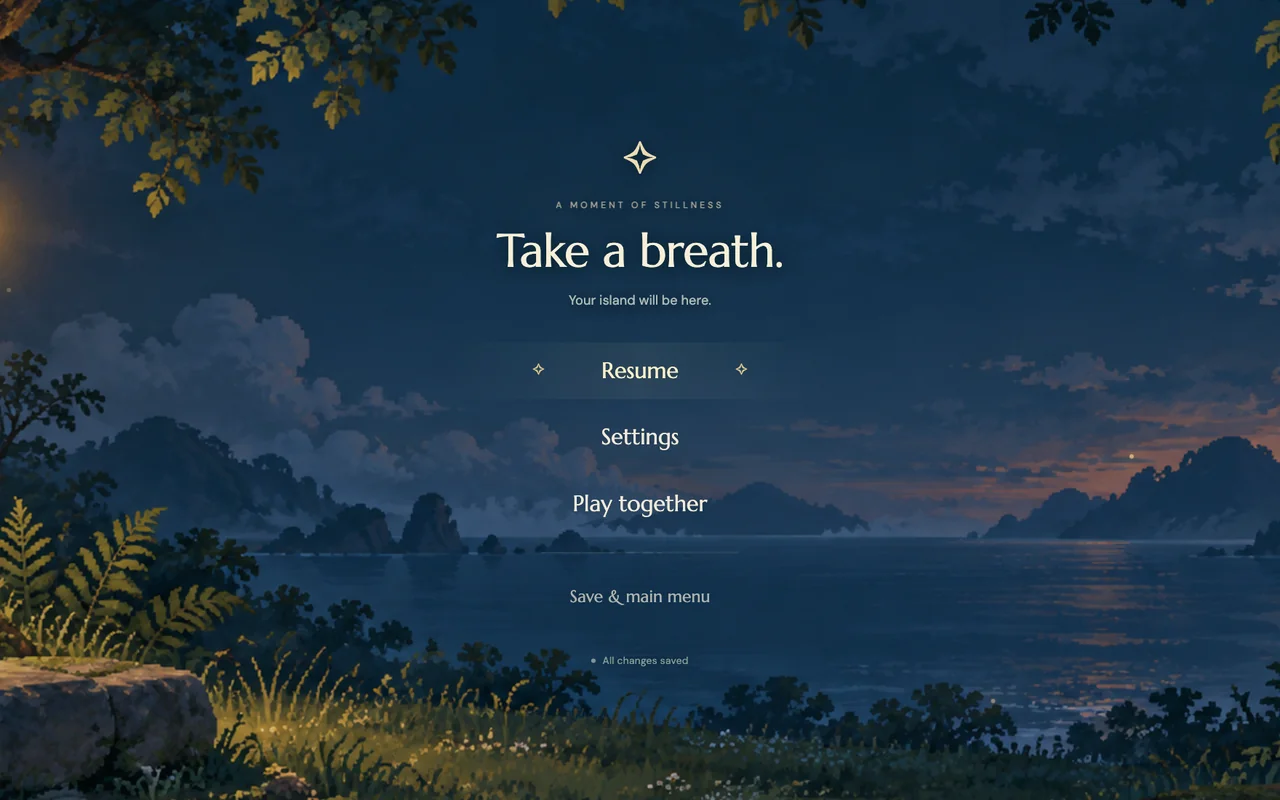
Step through the six methods, or use the arrow keys
Built only from code: flat colours, borders and soft shadows. The easiest to resize, translate and reuse for the HUD, and the least illustrative.
How does nine-slice scaling work?
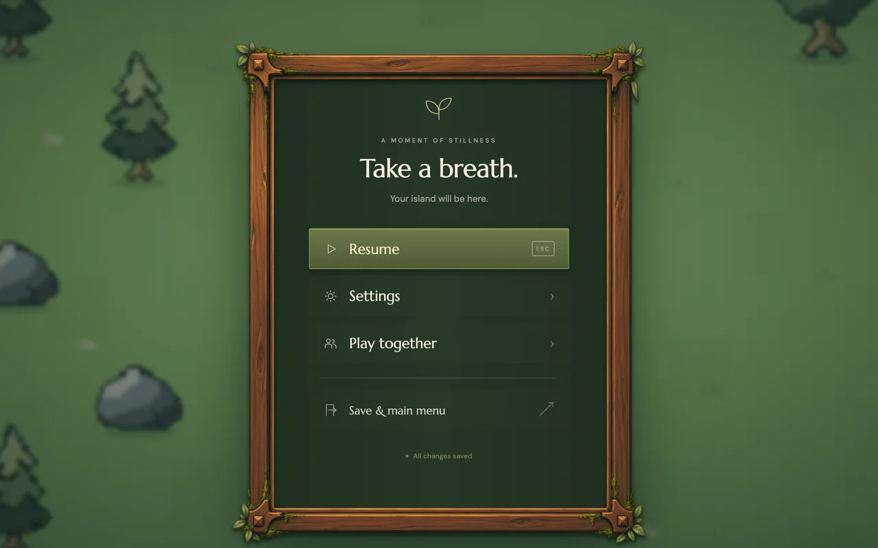
Nine-slice is the classic way to make one frame fit any size. Cut the image into a three-by-three grid: the four corners never stretch, the four edges stretch in one direction only, and the middle fills the rest. Godot has it built in, and on the web it's one CSS property. Try it with the painted wooden frame from the third study, then compare stretching the whole image, or keeping one fixed plate:
Pick a method, then change the menu's width
Why one plate, in pixel wood
For Mytheria we chose the plate, in a pixel-art wood that matches the world. Carved wood with leaves fits a game about forests and restoring old places, where a clean panel could belong to any app. The menu sits over the paused game, so you can still see where you are, which a painted scene would hide. And the pause menu's content rarely changes, so the plate's fixed shape costs little.
The plate's weakness, its fixed shape, is handled with sizing rules. The frame is 430 by 645 pixels on the 1280 by 800 canvas and grows with the Interface size setting as far as the window allows. If the window is too small for it, the menu switches to a plain panel instead of cutting off the frame. More on sizing in game UI text sizes.
Make one action obvious
Inside the frame, every action is a carved wooden button of the same size, 250 by 46 pixels, and the focused one gets a bright outline. Resume is first, so it's focused when the menu opens, and Escape closes the menu again. The exits, Main menu and Quit, sit apart behind a gap, so nobody quits by accident while reaching for Settings. If the world can't be saved, leaving stops and says so; see saves that survive a crash.
The bag uses the same material on a book page instead of a frame; its design is in game inventory UI design.
A checklist for pause menu design
- Compare options with identical content, at real size.
- Choose a construction method for each screen separately.
- Use nine-slice for frames whose size changes.
- Use a fixed plate only where content rarely changes.
- Keep the world visible behind the menu.
- Make Resume first and obvious.
- Separate the exits from everything else.
- Plan for bigger text and smaller windows.
Further reading
- Game UI readability: text sizes that work on every screenHow big should game UI text be? Valve's Steam Deck minimum, Mytheria's measured font sizes on every screen, and an interface size setting that reflows.
- Game inventory UI design: five versions and what each one taught usMytheria's inventory went through five designs, from a flat paper book to a live character on a stage. Step through each one and see what we changed.
- MytheriaPause it yourself: a pixel-art co-op adventure for one to four players.
Wishlist Mytheria
Mytheria is a pixel-art co-op adventure for one to four players, coming to Steam for Windows, macOS and Steam Deck. A wishlist is the best way to follow it and to help us.