Game inventory UI design: five versions and what each one taught us
Mytheria's inventory went through five designs, from a flat paper book to a live character on a stage. Step through each one and see what we changed.
On this page
- What makes a good game inventory UI?
- The short answer
- It started with three counters
- Make moving items safe
- Five versions, one screen
- Separate what you carry from who you are
- Leave decoration out until it earns its place
- Give it a material, but keep the interface live
- Show the real character
- Ground what you show
- The inventory today
- Building an inventory UI in Godot
- A checklist for game inventory UI design
Players open the inventory more than any other screen, and when it works well they hardly notice it. In Mytheria, our pixel-art co-op game, it went through five designs, each fixing a problem in the one before.
Every picture of an old version below was rendered fresh for this post, from the exact game build that shipped it.
What makes a good game inventory UI?
A good inventory lets you find, move and compare things without thinking about the screen itself. You should be able to read it at a glance and never lose an item by accident, and it should look like part of the game's world.
The short answer
What five versions of our inventory taught us:
- Show where a stack will land before you let go, and never lose an item when the window closes.
- Put the bag on one page and your character and gear on the other.
- Leave out borders, flourishes and patterns unless one of them helps you read the screen.
- A painted book page sets the mood, while the text, items and buttons on top stay real, readable controls.
- Show your actual character with your actual gear instead of a drawing.
- Give the character a floor and a shadow, because a character floating over a painting looks wrong.
It started with three counters
The first inventory was three numbers on the HUD, for wood, stone and crystal. That stopped working as soon as the game had more kinds of things to carry.
So we built a grid. Stacks of up to 99, a hotbar of nine, and the usual grid handling: left click picks up, places and swaps, right click takes half or places one, shift-click moves a stack between the bag and the hotbar, and dragging a held stack over several slots spreads it evenly.
Make moving items safe
A grid that drops what you're holding on the ground when you close the window makes players slow and careful, so we made moving items safe before doing any visual work. While you drag, every slot you cross shows how many it will get, and your hand shows what's left; nothing changes until you release. Escape, or letting go outside the grid, puts everything back.
Closing the window returns a held stack to the slot it came from, or to any free slot, and dropping items on the ground is always a separate key. Hovering a slot shows the item's name, count and what you can do with it, so the controls are explained where you use them.
Five versions, one screen
Here is the inventory in each version, rendered from the build that shipped it. Step through them.
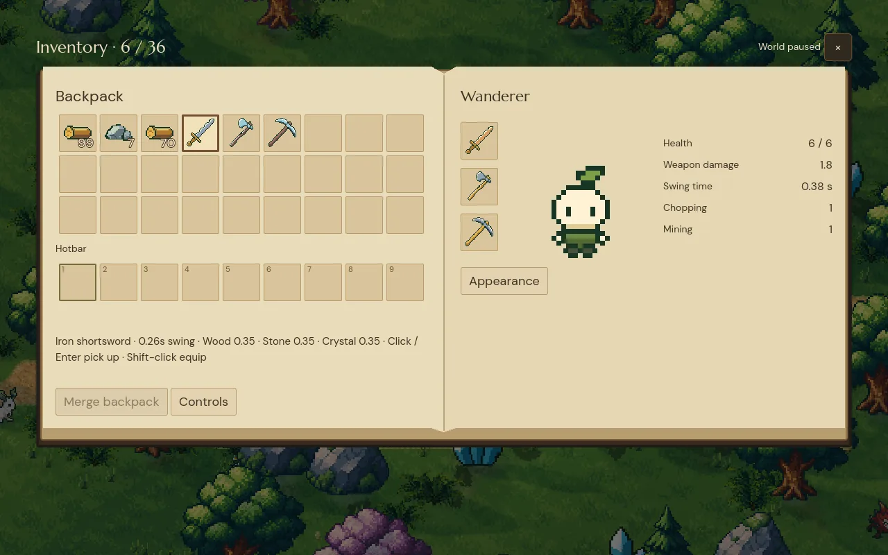
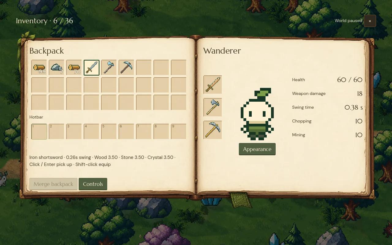
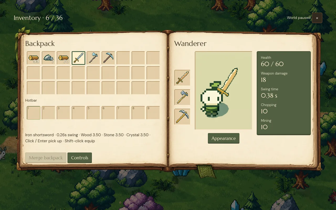
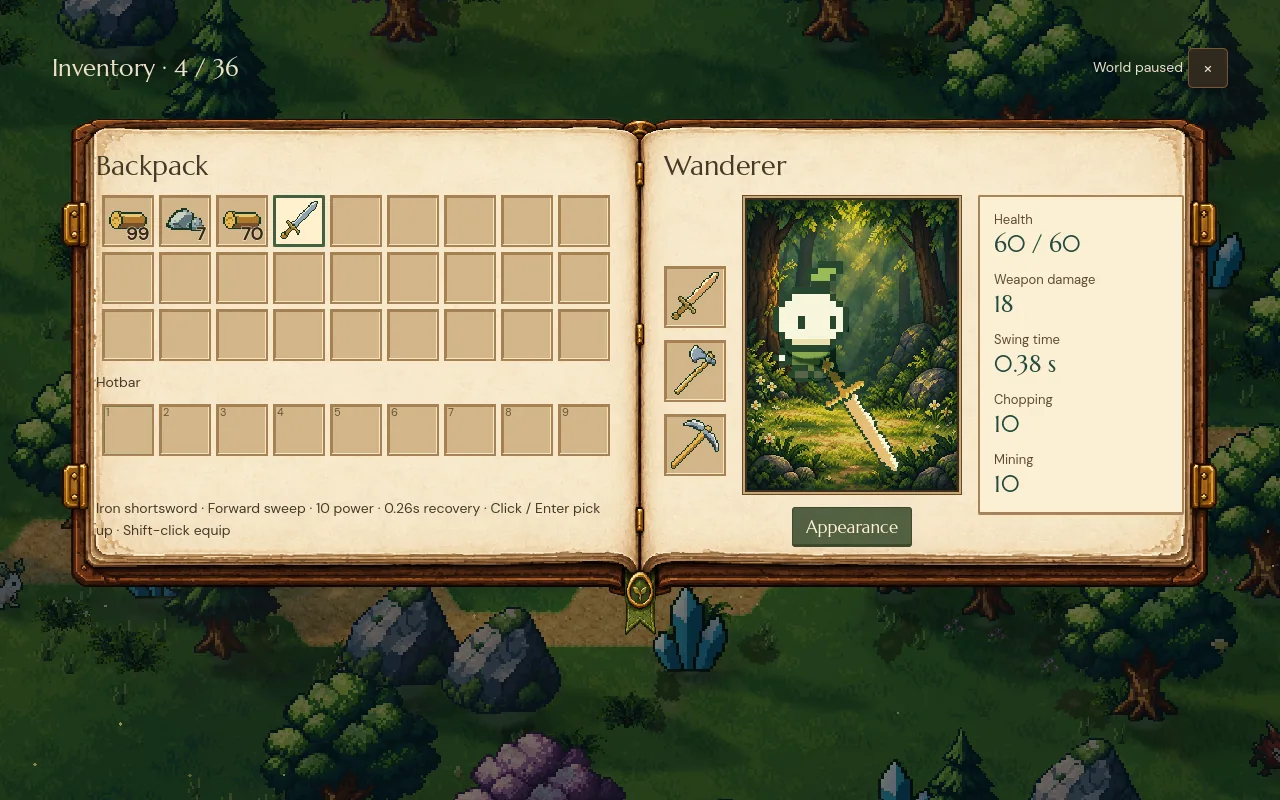
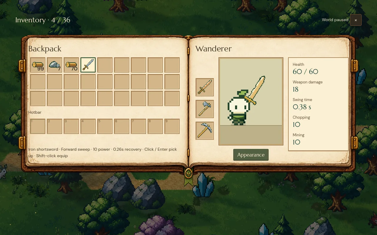
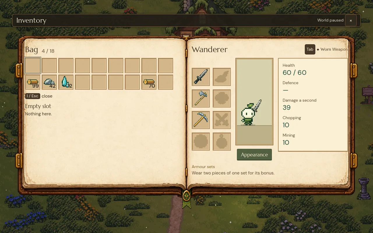
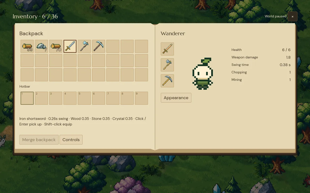
Step through the versions, or use the arrow keys
An open book: everything you carry on the left page, your character, gear and stats on the right. Gear became icon slots beside the character, with grey outlines when a slot is empty and names on hover. No patterns, no extra lines.
Separate what you carry from who you are
An inventory does two jobs: managing items and showing your character. Mixed into one grid, both get harder to use. A book has two pages, one for each job. The bag stays on the left, where your eye starts, and the right page shows what you're wearing and what it does.
The character page shows only real numbers from the game: health, weapon damage, swing time, and how hard you chop and mine. When you equip something, they change in front of you.
Leave decoration out until it earns its place
It's tempting to dress a book screen with borders, corner flourishes and divider lines. We left them all out and kept plain slots with one fold down the middle, which keeps the screen calm. Empty gear slots show a muted outline of the tool that goes there, so even an empty screen tells you what to do.
Give it a material, but keep the interface live
Flat paper made the book look unfinished, and a painted page fixed that, as long as the painting stays in the background. The book is one background image, cut into slices so the binding and corners stay the same size on a wide screen and on a narrow one. Everything you read or click sits on top as normal interface: text stays sharp at any size, every slot can be reached with a keyboard or controller, and high contrast still works.
On a painted page, thin stack counts got lost, so they now have a heavier weight and a dark outline.
The pause menu uses the same idea with a carved wooden frame; we compared six ways to build it in pause menu design. Because the text stays live, it can also grow: at a bigger interface size the page rearranges itself, as shown in game UI text sizes.
Show the real character
A drawing of your character goes out of date the moment you change your look or pick up a new weapon. So the inventory shows the actual character from the game, with your appearance, the weapon you're holding, the game's own lighting and its idle animation.
A fixed camera cuts long weapons off at the edge, so the frame is measured from the character and the weapon each time either changes, and any blade fits.
Ground what you show
The fieldbook version put the character in front of a painted forest clearing. It looked lovely in a still, but the feet didn't touch anything, so the character seemed to hover. A solid floor alone still left empty space under the feet. The version that works is a quiet two-tone floor with a small contact shadow, placed from the position of the feet. Our lighting follows the same idea of making things sit in the world.
The inventory today
The grounded fieldbook is still the inventory today, with one big change: the bag is now part of progression. You start with one row of nine slots, and rows are added as you go, up to five. Your gear has grown too: a weapon, an axe and a pickaxe, armour for head and body, a charm and two trinkets.
Building an inventory UI in Godot
We built it with Godot's own UI nodes. Every slot is a real Button, and the icon, count and key number inside it ignore the mouse, so the button gets every click, focus works with keyboard and controller, and each state (hover, focus, pressed, selected) has its own look. The drag preview runs the same stacking code the game uses to apply the move, on a copy, so the preview always matches the result.
The portrait is a SubViewport with its own World3D, camera and light, showing a copy of your look and gear. It never touches the real game, and it stops rendering when the inventory is closed. The book art is drawn in slices so the binding and corners keep their size at every window shape. In co-op, a guest's inventory sends requests like "move this stack here", and the host checks them before anything moves.
A checklist for game inventory UI design
- Make every move previewable and cancellable, with no way to lose items.
- Split items and character into two clear areas.
- Start plain, and add decoration only where it helps.
- Use art for the material, and keep text and controls as live interface.
- Show the real character with its real gear.
- Give whatever you show something to stand on.
Further reading
- How to make combat feel goodHow we made combat feel good in our indie game Mytheria: hitstop, hit flash, knockback and screen shake, with real frame data you can try yourself.
- Pixel art lighting in Godot: real lights in the worldHow we light Mytheria's pixel art in Godot with real lights, local mist and time of day instead of screen filters. Drag the sun through a whole day.
- MytheriaThe game this inventory belongs to: a pixel-art co-op adventure for one to four players.
Wishlist Mytheria
Mytheria is a pixel-art co-op adventure for one to four players, coming to Steam for Windows, macOS and Steam Deck. A wishlist is the best way to follow it and to help us.